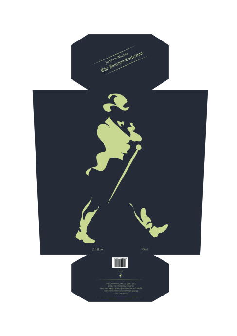
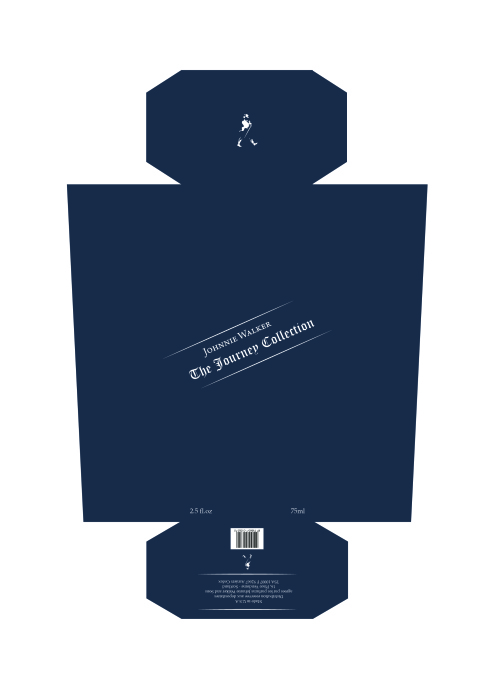
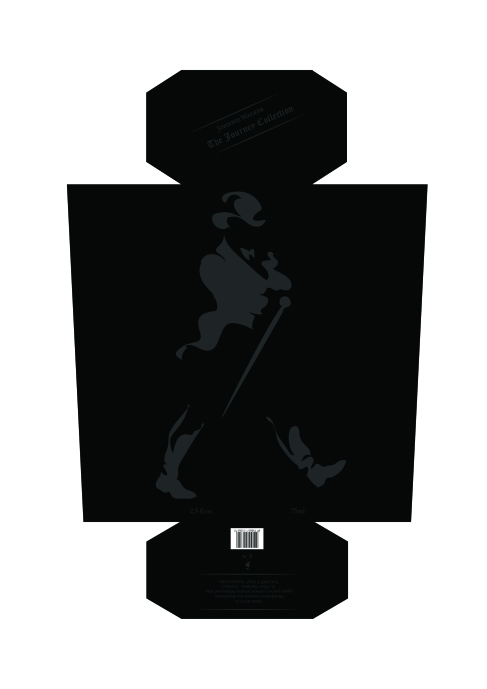
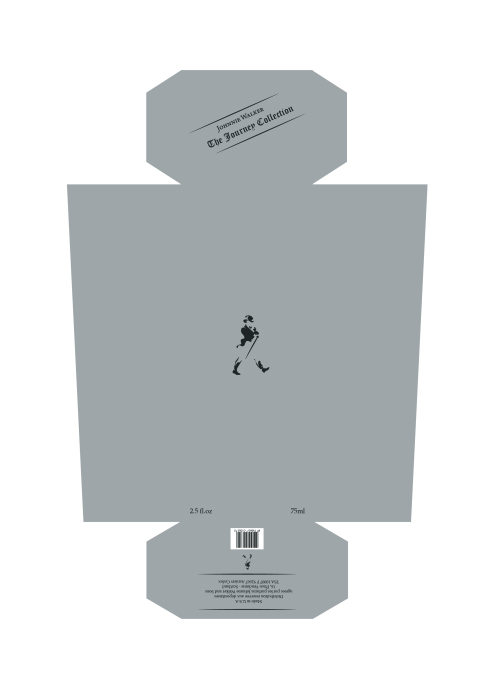
Having an understanding as to what style of packaging I will be constructing, I began producing visual responses for each component of the design, with this in particular series of designs being for the outer sleeve for the product. In this design process I conformed to the typical traits found on the Johnnie Walkers products themselves such as typeface, logo and the types angle of 24 degrees. I also decided to stick to very basic and neutral tones as when undergoing research I came to a realisation that not many colours had correlations with the word ‘Journey’ and using neutral tones such as grey and black allowed an element of enigma to be captured.
Outer Packaging Design Ideas
Published by
Random Repeat
This blog showcases articles / posts posted by other people. It shows what people do to make a difference. It displays the talents of people such as photography, writing, blogging and various other talents. Random Repeat entertains through videos and adds humour through jokes and funny gifs. It also educates with infographics, etc., and offers advice like DIY stuff and covers topics like health and motivation. It also gives a chance for people to be heard or seen again. Many times people put in a lot of effort to make their post or work stand out, but it rarely gets noticed. Random Repeat helps to get it noticed, if only a little bit more. View all posts by Random Repeat


